Tridge
Purchase Order Management
One standard for purchase orders

Purchase orders are the backbone of trade operations, but teams kept them in their own spreadsheets with different formats. The goal was one standard for purchase orders, with shared fields and automated steps that teams could rely on.
I designed the interface on top of the data model, guided by user interviews and observation.
Problem
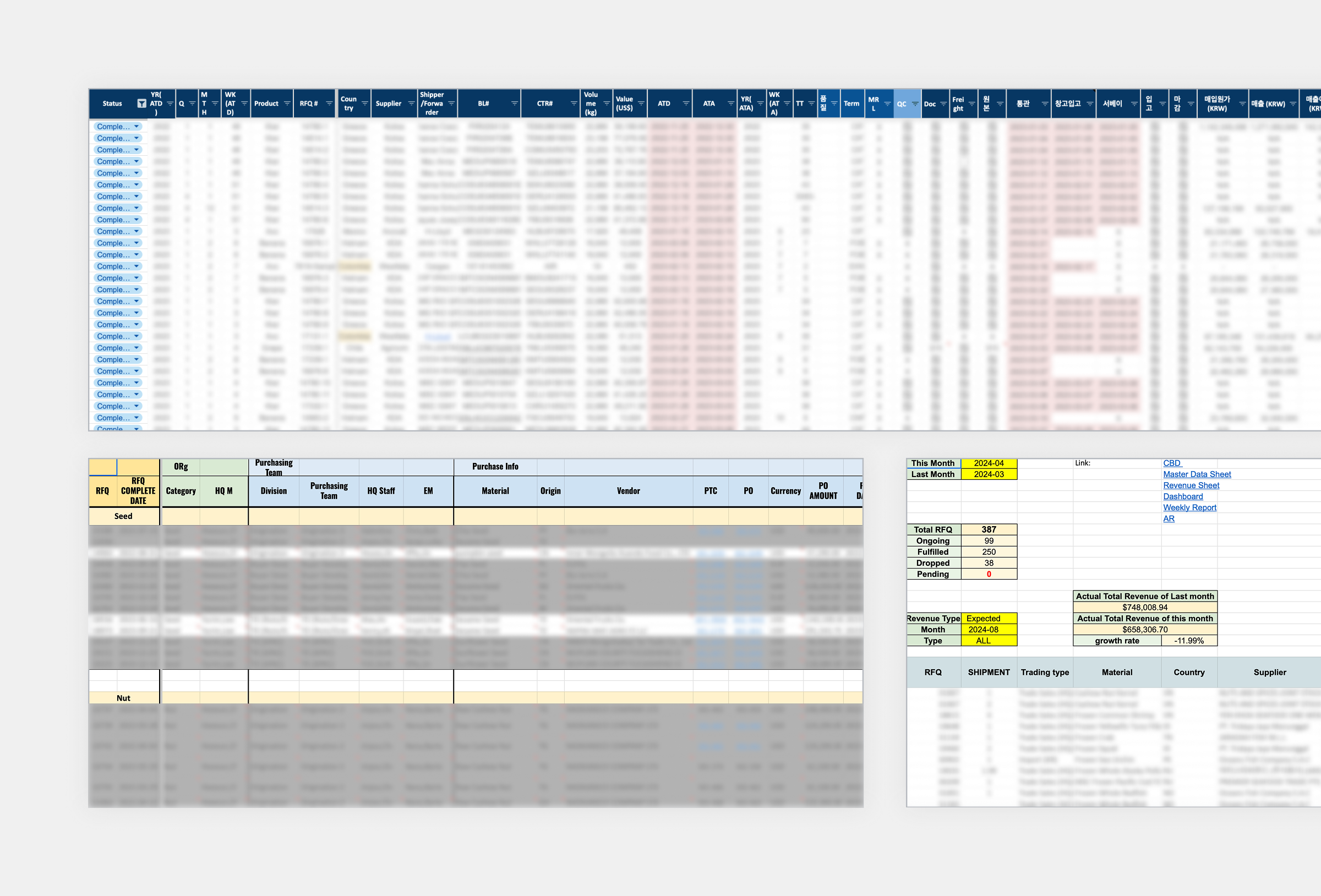
Information was listed without hierarchy, hiding the context of each purchase stage. Each team kept its own file version, so data didn't match and operators struggled to track order status in real time.
Process
The product team set the core data from user observation. Engineers then built the ERD.
Solution
Every action on a purchase order is grouped by the part of the workflow it belongs to, from order info and expenses to shipment, B/L and invoice.
01
How trade teams really work
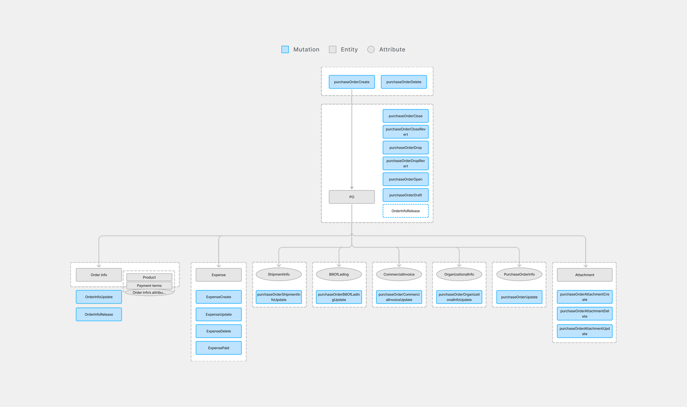
Accuracy mattered here, because in a work tool even a small mismatch with how operators think about their work can cause real delays. Our design lead turned the engineers' ERD into a concept diagram for the interface.
That diagram defined what an order needed to contain, but not how people actually worked through it. I ran quick and informal research alongside it to fill that gap, asking operators questions as they worked. Short interviews, screen recordings and a look through their work files filled in the rest.
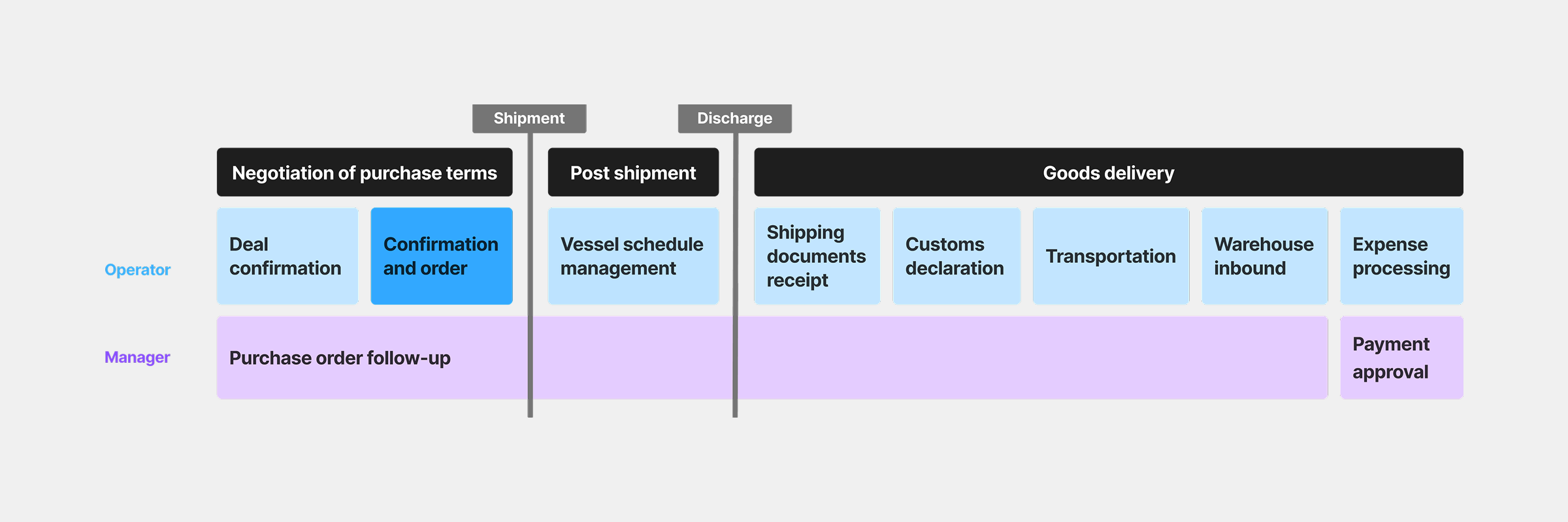
Two patterns came up again and again. The recordings showed operators going back to the details agreed at the confirmation and order stage, jumping between files and tabs or opening the same file twice in split windows. In interviews, those with many orders said they wanted to see them all at a glance. Managers who approved each step needed that overview too. Their spreadsheets kept the information in separate files, so even one small change meant hunting through all of them.
Data model
Our design lead turned the engineers' ERD into a map of the objects operators handle and the actions that change them, with each object's key details attached. I regrouped it by workflow stage, which showed where each action should sit in the interface.
They kept looking back
From negotiation to goods delivery, operators kept returning to the details agreed at the confirmation and order stage. Managers followed every trade through to payment approval.
02
From data model to screen
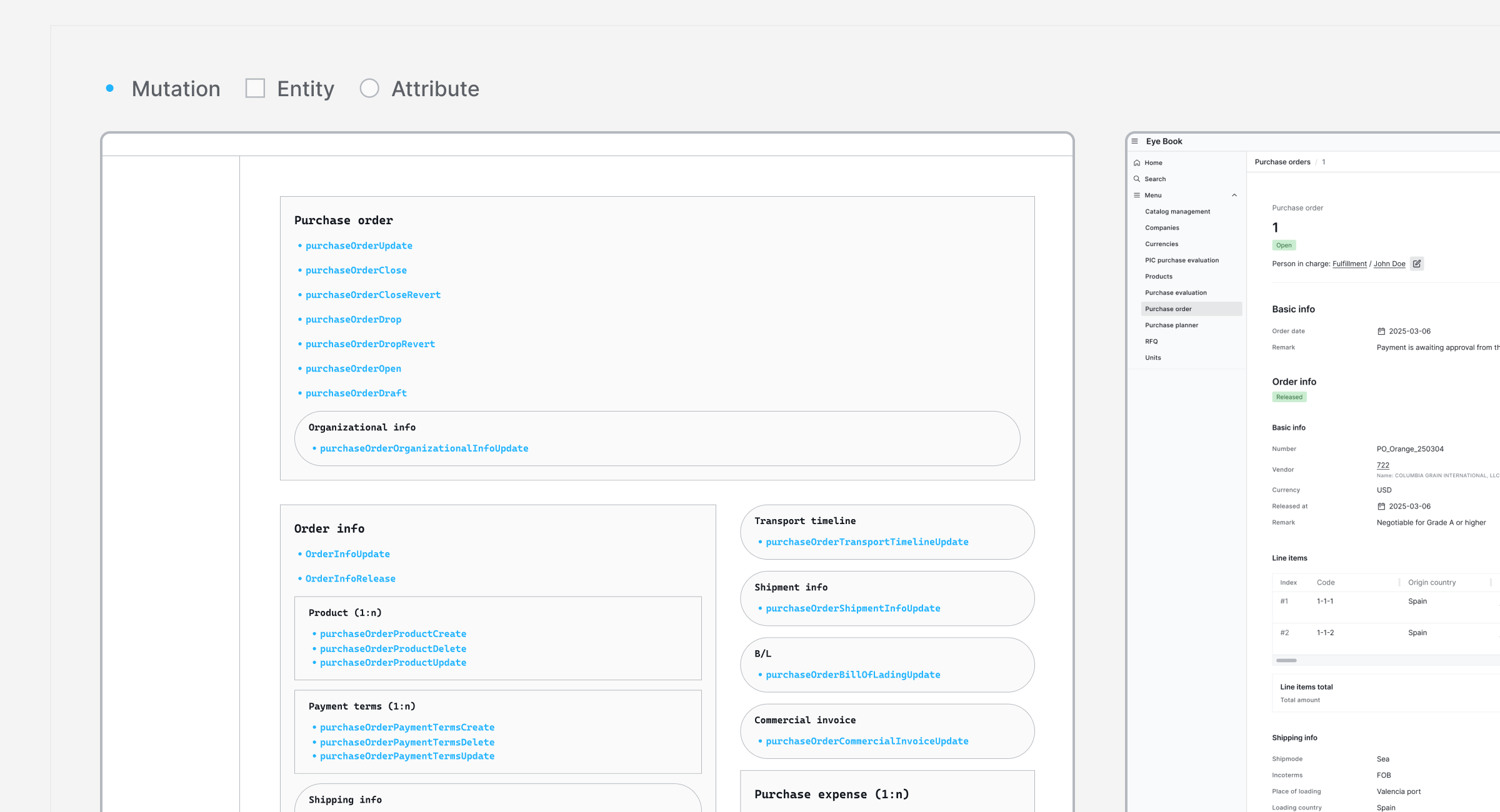
The wireframe followed the data model. I reorganised the concept diagram by workflow, then turned each entity into a section and each mutation into an action inside it. Every button on the page now matches a real change in the data.
The research shaped where things sit. Operators kept going back to the original purchase order while handling later steps. The purchase order now stays on the left as the master with post-order details beside it. Users can check the order and enter new data without switching screens. On the list, operators kept updating details such as negotiation terms and vessel schedules throughout each trade. An editable table that works like a spreadsheet lets them do that without leaving the list.
Wireframe
Each mutation sits in the section where its interaction belongs, so the screen mirrors the data model.
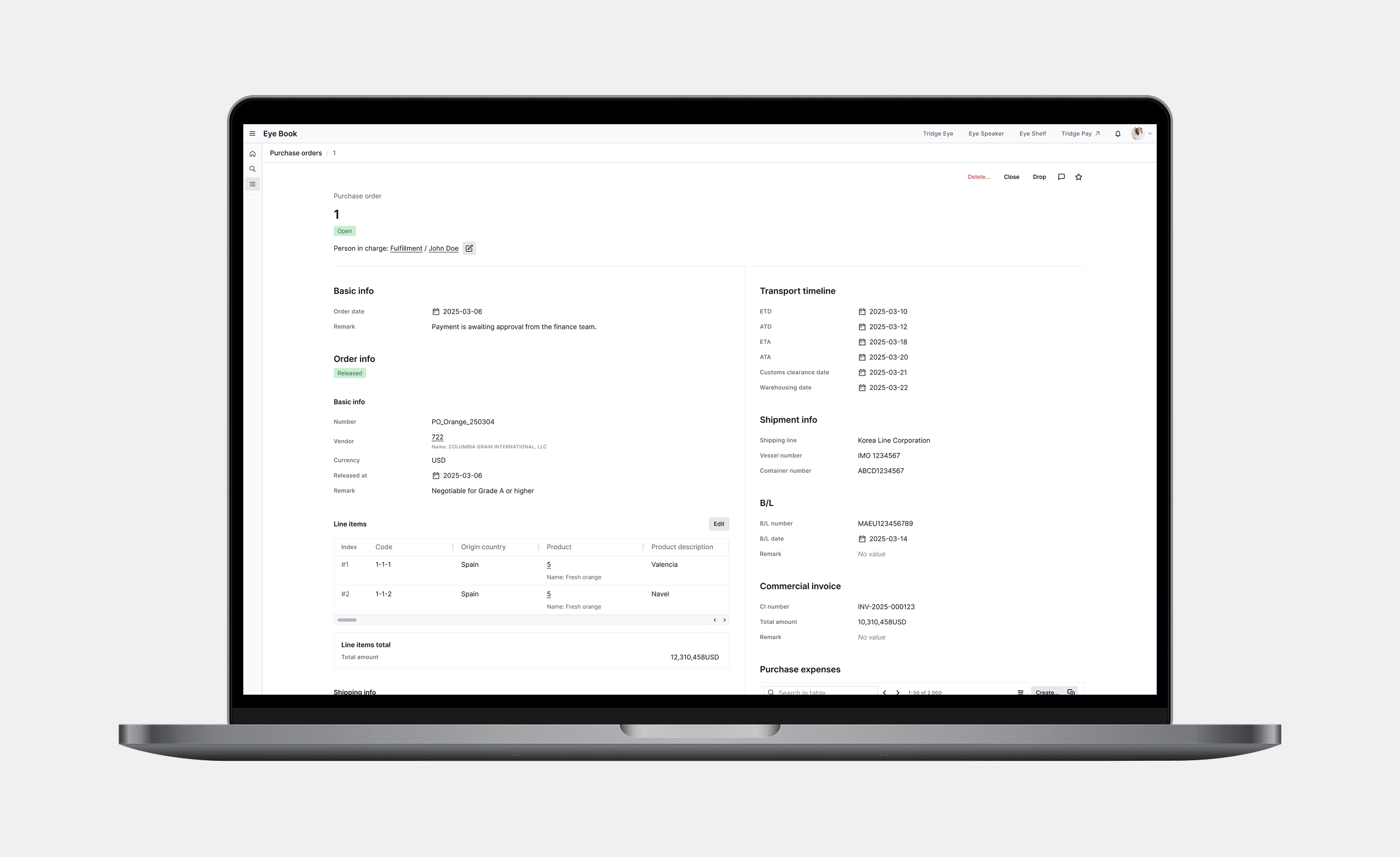
Master and details side by side
The original order stays on the left. Product information also remains visible after shipment, so users can check related details at every stage.
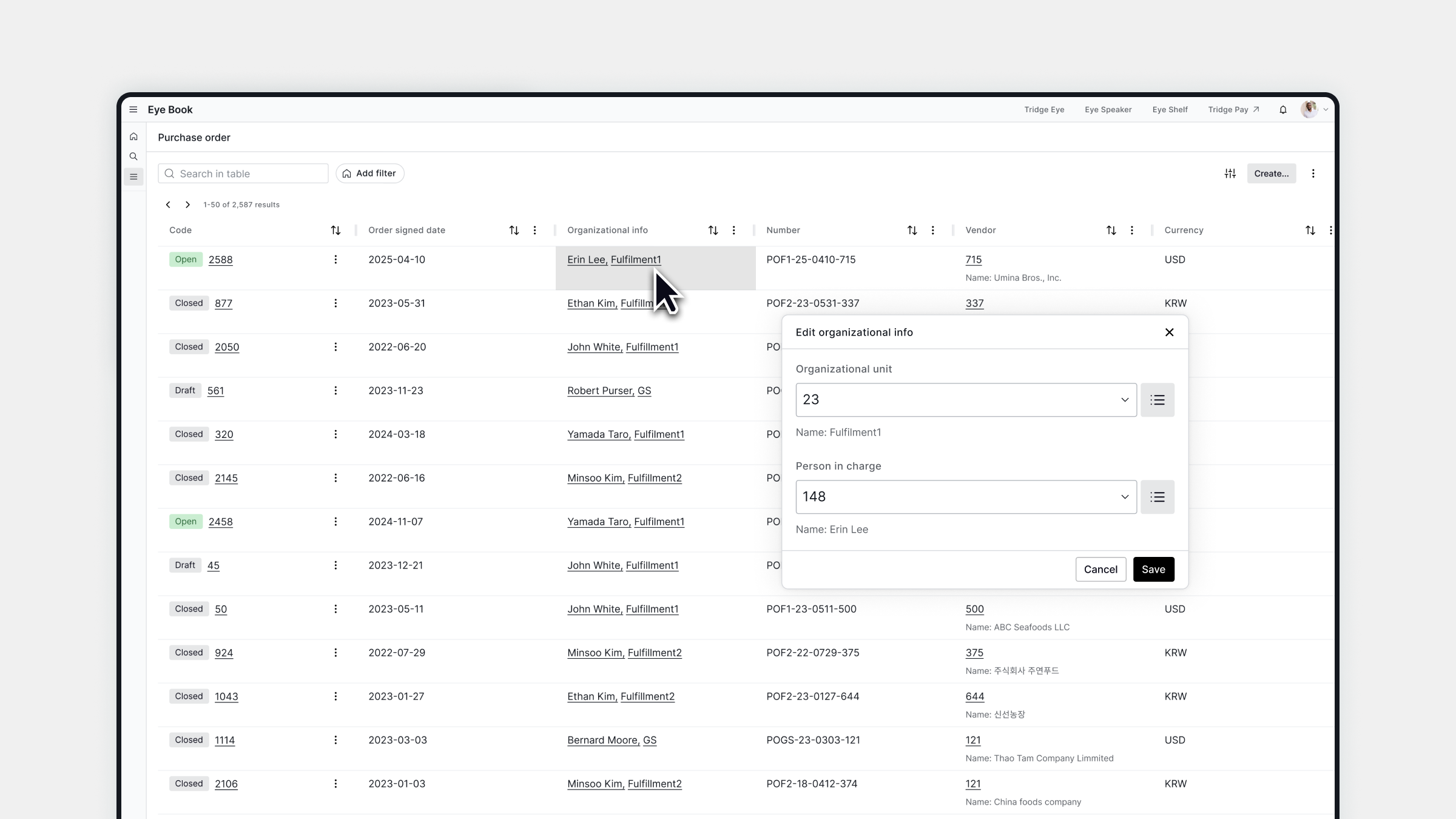
One table for every trade
Each cell opens an edit modal that fits its data type, so operators can update orders without leaving the list while managers see every trade on one screen.
03
Historical data in one upload
A new standard only helps if past orders can move into it. Teams kept their history in their own spreadsheets, in formats that differed from team to team.
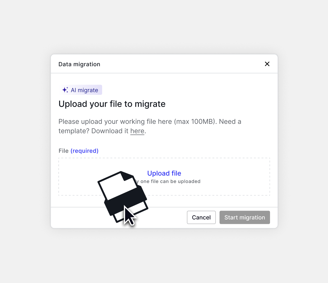
Users now upload the file they already work in, and AI turns it into system records such as purchase orders, products and companies. No technical help is needed.
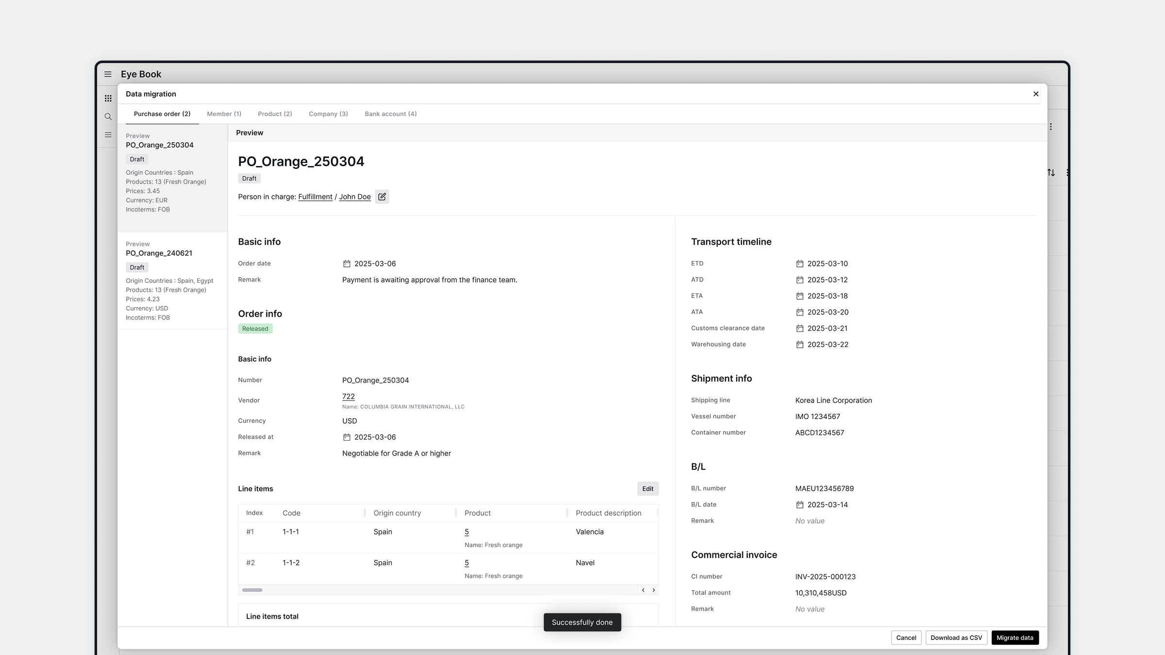
Drafts before anything is saved
Converted records appear in a preview, grouped by record type. Since this is core trade data, one wrong record would carry into every order that uses it. I designed every record to arrive as an editable draft that users can check and fix before anything is saved.
Results
Pilot test before full rollout
Before full rollout I ran a scenario-based pilot test with two fulfilment team members who manage purchase operations. Both completed a purchase order on their first try, taking about five minutes on average. In the spreadsheet-like table neither had to search for where to enter data, and both entered it without mistakes. Afterwards both went back to the list and edited orders without any help.
Once the tool is in daily use, the next step is to measure it in real work. Error logs would show which fields still cause mistakes, while task time and how often users switch panels would show whether the side-by-side layout feels natural.
2 of 2
Completed a purchase order on the first try
~5 min
Average time to complete a purchase order
Scenario-based pilot with two fulfilment team members

